Tiling the floor
Some time ago, I started contributing to a city builder game called Cytopia. It reminds me of SimCity3000, one of my all-time favourite games which means I very much enjoy working on it. Even if you had only a short look at both games, you could see an immediate connection: Both use an isometric1 view to represent a three-dimensional cityscape using only 2D sprites.
This graphical trick is a big part of the look that makes both of these games so appealing to me. It also makes getting the sprites onto a screen a little more difficult than just having them on a grid made of horizontal and vertical lines. There are some caveats you have to keep track of. I will address one of them, namely the fact that rectangular tiles are not centred correctly sometimes, on this page. But before we get to rectangles, it’s a good idea to start slow and look at the humble 1x1 square tile first.
When intending to place anything on a grid, it’s usually helpful to first consider the coordinate system that you are going to use. For isometric grids, the coordinate axes are lines that have a fixed angle regarding your usual, horizontal X-axis. One of these axes has the positive angle , while the other will have it’s negative counterpart . If you’re interested: Cytopia uses an angle of approximately .
The tricky part is that you never actually see the grid in-game. You only have one vantage point for the location of your tiles: The neighbouring tiles. With that knowledge we can have a look at the somewhat abstract visualization that will be used from now on.
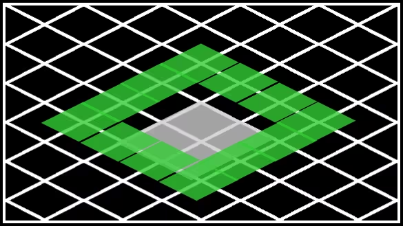
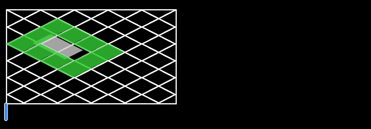
What looks like a chain-link fence below is the aforementioned grid. The grey tile represents the one we want to place, and the green ones are the surrounding tiles. In the game it would usually be a building surrounded by grass, dirt or road tiles.
Placing the frame
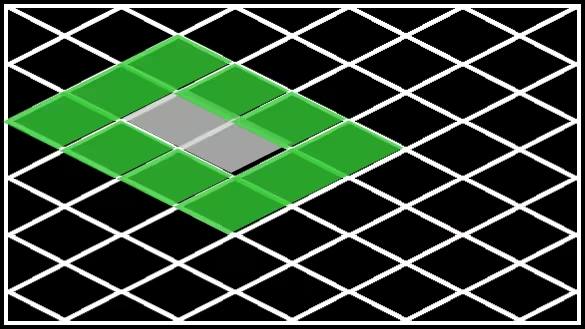
Now this looks quite nice already. Each tiles’ centre is aligned with the grid and all is well. Or is it?
Actually, the fact that the grid and the tiles fit together so nicely for our 1x1 square is pure coincidence. Cytopia uses a library called SDL2 for putting graphics onto your screen2, which by default places images so that they extend to the right and bottom relative to the screen coordinate you placed them at.
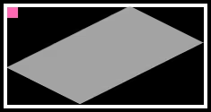
Think of it like hanging a painting on your wall: After deciding where the painting should go, you put a nail into the wall at the position where you want the middle of the top side of the painting to go. When hanging digital “paintings” onto your screen, it’s mostly the same process, but the top left is used instead. The graphic below showcases this with the pink rectangle being (roughly) at the ‘anchor point’ of the tile.
</div>
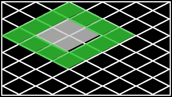
Since we fixed the upper left corner of our tiles, this means that the centre starts to move when we scale up the square. At the end of this section you can see a 2x2 square, whose centre no longer sits in the middle of the gap where it should be, making it seem like it’s sunken into the ground.
Calculating the best spot
We obviously need to do some maths on the coordinates of our sprites before placing them. And while we’re at it, we can use the opportunity to ask ourselves what we want a good placement to look like. Since it’s still rectangular images were dealing with, albeit rotated a bit, it seems reasonable to try the same thing that SDL2 does and have the coordinate at one of the corners. In our case, however, the corners of the sprites are located at the edges of the images. Which of the four corners you use to pin the tile to is left to taste, but since Cytopia uses the one on the bottom, this is what I’ll do here, too3.
Here is the code that does this in the game.
It moves the image up by its height and left by half of its width.
(You can find it in src/engine/Sprite.cpp)
for (auto &it : m_SpriteData)
{
  if (it.texture != nullptr)
  {
    // render the sprite in the middle of its bounding box so bigger than 1x1 sprites will render correctly
    it.destRect.x = m_screenCoordinates.x - (it.destRect.w / 2);
    // change y coordinates with sprites height taken into account to render the sprite at its base and not at its top.
    it.destRect.y = m_screenCoordinates.y - it.destRect.h;
  }
}
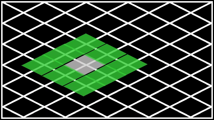
The intent here is to move the tiles’ coordinate to their bottom corner, where we want it to be. Additionally, since we respect the size of the graphic, the centres stop moving around when we scale up our squares! Below you can appreciate the correct placement of a 2x2 tile. (I’ve sneakily moved the relative position of the grey tiles’ centre so it’s correct for the new calculation.)
Troubles with rectangles
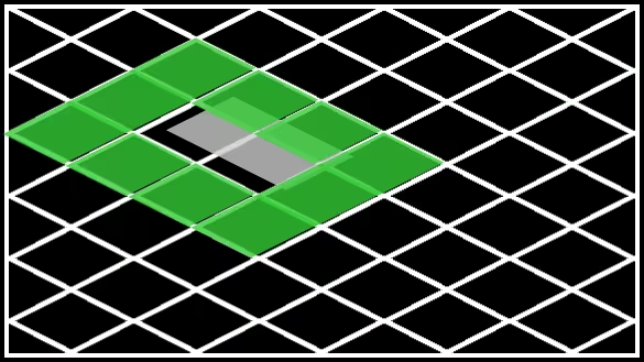
But now it’s all right, isn’t it? Well the problem linked in the first paragraph talked about rectangles, but all tiles we have seen so far were squares. So let’s have a look at a 1x2 tile:
Approaching the issue
Yikes!
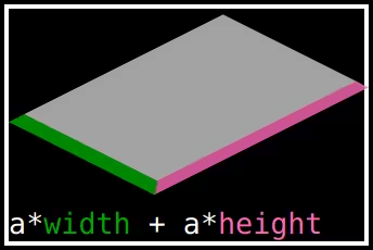
Now, obviously this must have something to do with the aspect ratio of the tile. What is the exact connection though? Well, if you consider the width of the image, it’s made up of the height and width of the isometric tile like this:
Where is a constant factor that comes from the projection of the sides of the sprite to the screen coordinates. It will cancel itself out in the following computation, so it’s of little interest for this specific deliberation.
To have the lower corner at , we would need to shift the tile by instead of constantly . The above code just handled the special case of square tiles!
At this point I’d like to go on a bit of a tangent regarding my approach to solving this problem. The above idea occurred to me after some time of moving this problem around in my head, but I didn’t want to write too much code touching different systems of the game just to test it out. Sadly, getting the aspect ratio of the tiles at that particular place in the code would have required just that.
So what does a physics student like me do when faced with such a situation? Try to find the laziest method of trying out the fix. In my case that was simply to look at which rectangular tiles I could find in the game, calculating their aspect ratio and hard-coding it into the code to see if I had fixed it. Here’s an example of the code that I used for a 1x2 tile:
for (auto &it : m_SpriteData)
{
  if (it.texture != nullptr)
  {
    // render the sprite in the middle of its bounding box so bigger than 1x1 sprites will render correctly
    it.destRect.x = m_screenCoordinates.x - (2 * it.destRect.w / 3);
    // change y coordinates with sprites height taken into account to render the sprite at its base and not at its top.
    it.destRect.y = m_screenCoordinates.y - it.destRect.h;
  }
}
Sounds easy right? Well it was. But did it fix my problem?
See for yourself! This is where the promised CSS trickery comes in. Below, you see another 1x2 tile, but this time it’s a little more to the left and there is a text box below. If you type enough characters inside, you will start to change the hard-coded factor for all tiles. Play around with it a bit before moving on.
Problematic solutions
When changing the multiplier for the horizontal offset, all tiles moved, with the wider ones moving faster than the others. And, knowing the code, we can see why. The offset depends on the width of the sprite and multiplying something with a large number produces a large number.
Now imagine that you weren’t able to see the grid and the neighbouring tiles were the only reference you had to check whether the offset was correct. That was where I was at. My supposedly smart solution of pre-computing multipliers mostly served to confuse me with the rectangular tiles moving relative to the square ones in a (at least to me) surprising fashion. All of this was complicated by me having to recompile the whole game every time I wanted to check out a different multiplier.
I spent some time trying out more and more complicated ways of calculating different fractions to use as multipliers. But finally, with the lazy attempt failing me, there was little left to do but actually try out the full implementation. You can see the result here:
Closing thoughts
Now there’s a glaringly obvious moral to this story: “Don’t be lazy”
I don’t think that’s the thing you should be taking away though. Rather I’d say: “Do attempt to be lazy, but don’t forget what you’re doing is just a lazy attempt”. What initially got me confused was that I thought of my lazy attempt like it was the actual, correct thing I wanted to implement. I didn’t consider the flaws that I introduced with my laziness as a possible source of errors. That lead me on the wrong path of trying to fix my lazy attempt for too long instead of disregarding it as just a failed attempt and moving on.
There is, however another reason4 why it took me almost a year to push a comparatively small commit. After my lazy attempt failed me, I swung back the other way, so to speak. Instead of just changing the relevant parts in the code, I went about and created a toy environment to test my solution. You are looking at it right now.
Partly to combine the efforts of getting enough stuff onto this here website to justify publishing it, but also to make fixing this bug more of a fun puzzle, I recreated the behaviour of tiles in an isometric engine using HTML and CSS5. The somewhat broken CSS you see here saw my implementation of the horizontal offset calculation before Cytopia did.
After making sure it actually works, I rewrote my solution into C++ and created a pull request. You can find the PR here and the Commit here.
I will continue to contribute to Cytopia in the future. I hope that it will happen more frequently than for this issue, but most of all I hope Cytopia will become a fun game and that you will have a look at it from time to time to see whether we’re there yet.
-
Technically speaking it only uses a kind of axonometric projection, but for the rest of this text I’ll use the slightly less exact but more common term “isometric” to describe it. ↩
-
Among other things like handling user input and audio. ↩
-
It also seems like the most intuitive option to me since I’d usually expect the positive axes to point up. ↩
-
In reality there are many others, all of which have more to do with my personal life rather than Cytopia though, rendering them irrelevant to this discussion. ↩
-
I actually used the full stack of Sass and Liquid that Jekyll provides, but in the end it comes down to HTML + CSS for rendering. ↩
 </div>